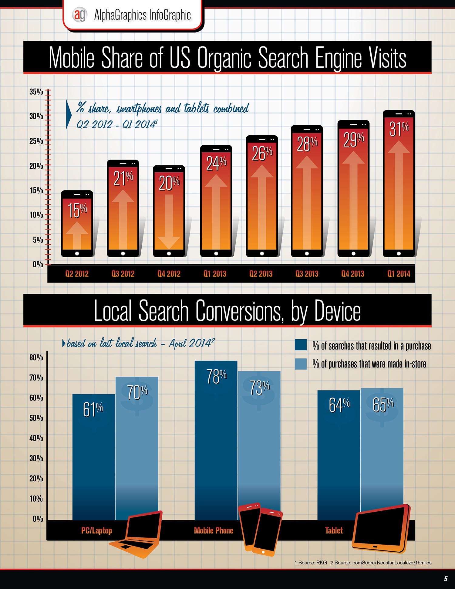
In Feburary 2014, for the first time ever Americans used mobile devices more than PCs to access the internet.
Also, 4 out of 5 consumers use their smartphones to shop online. These statistics show a powerful need for marketers to re-evaluate their online presence.*

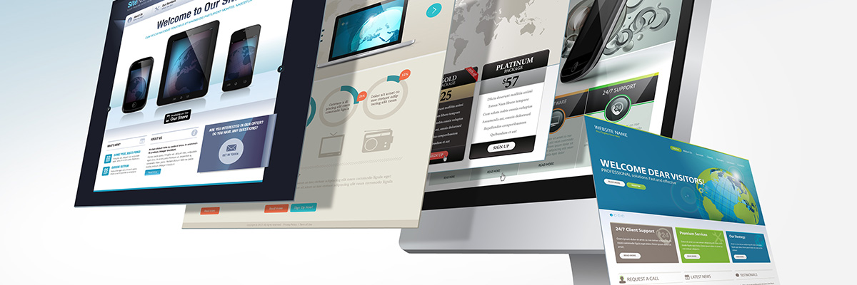
What is Responsive Web Design?
At its core, responsive design is creating websites that are “device agnostic”, meaning the same experience is maintained no matter what technology it’s being viewed on (desktop computers, laptops, tablets, smartphones, etc…). It also means stripping out the unnecessary graphic elements and concentrating on usability and speed, forgoing bandwidth-sapping frills and creating a user-friendly interface design.
Some consider responsive design a series of coding techniques, and some consider it a concept that exists outside of any coding language – an ideal that every web designer should strive for.
It’s essentially future-proofing a site, planning ahead for most potential device form-factors and resolutions.
How Do I Make My Site Responsive?
Without getting too far into the technical aspects of responsive web design, the practice involves using “liquid layouts” (sites that rearrange and re-flow based on the width of the viewing device), variable-sized images, and media queries (bits of code that only display certain styles, layouts, and images based on the viewing device’s width and/or resolution).
There are hundreds of resources online for responsive website templates, and if you are a wordpress user or developer, you already have a head start because many wordpress themes (including the official wordpress ones) have responsive design built in. Responsive designs do come at a cost, however, mainly due to the development time necessary to add the extra code for a site to flow and resize properly.
Why Do I Need a Responsive Site?
 Besides the obvious benefit of having a site that looks great on almost any device (reason enough to have a responsive site), there are huge SEO and lead conversion perks that come with having a fast, user-friendly website. On average, a user gives a website 2-5 seconds to load on a smartphone or tablet before impatiently moving on. We have precious little time to capture someone’s attention, which is amplified when they’re on the go and relying on a cellular data connection.
Also, Google factors the loading time for websites into its page rankings. Slower websites move down in rank, so it’s in any business’s best interest to make their site load as quickly as possible. Questions? Feel free to contact us here to learn more about the responsive web!
* Source: www.convinceandconvert.com/

