Google recently updated their Search Quality Rating Guidelines, and – no surprise – mobile experience now plays a bigger role than ever in determining search ranking.
If you have the time, it’s a good read here. In light of Google’s newest guidelines, did you know that you can spoof mobile devices using Firefox to test your website on many different mobile devices, screen sizes, pixel ratios, and even network speeds? For example, say you wanted to see what your website looked like on an ipad mini that only had 2g network speeds. You can accomplish that just by choosing a couple dropdowns in the Firefox Development Tools Inspector. Here’s how:
- Open Firefox and navigate to the website you want to test.
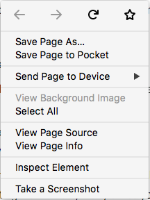
- Right click on any element within the page (it doesn’t really matter which, but I just find a bit of text and click) and choose “inspect element” (screenshot below).
- The Development tools window will popup. For most users, it comes in attached to the lower portion of your web browsing window, but you can also “detach” it into it’s own window for convenience.
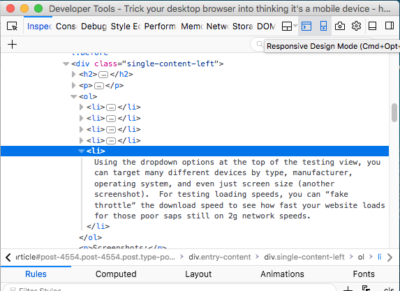
- In the top left corner of the inspector window, there’s a little mobile device icon (screenshot below). Click it and the webpage you’re viewing will translate into the mobile testing view. *note, many times you have to reload the page to make the view update properly.
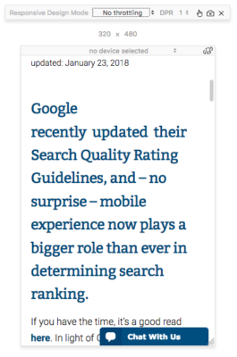
- Using the dropdown options at the top of the testing view, you can target many different devices by type, manufacturer, operating system, and even just screen size (another screenshot). For testing loading speeds, you can “fake throttle” the download speed to see how fast your website loads for those poor saps still on 2g network speeds.
Screenshots:
Screenshot 1. Right Click on an element of your webpage and choose “inspect Element”.
Screenshot 2. After the developer tools console opens up, click the small smartphone icon in the upper left hand corner. The Mobile testing view will replace your current webpage (make sure to reload the page)
Screenshot 3. Use the dropdown options to tailor your view to the device you want to test. You can test device, orientation, screen size, pixel ratio, and even network speed!
This tool is invaluable in making sure your site is mobile responsive not just for smartphones, but tablets, laptops, and even super high resolution desktops. We use the developer tools on Firefox for our web development too, but this little trick is great for anyone to test out their site on lots of devices. If you’re feeling adventurous, feel free to dig around the developer console for more little handy tricks such as testing loading speed of all the files, or even seeing some of the actual source code of the site!
I hope this little tutorial helps out those of your still on the fence about making your site responsive. Give us a call today at 406-256-4999 if you’d like to chat with someone about get your site up to SEO snuff!

